Getting to the truth
The starting point was to help Water Witness define what it does and how. This was a challenge for a charity used to the ironically dry language of water resource management.
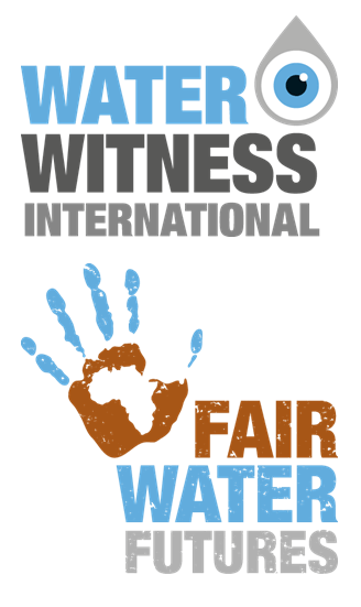
Water Witness International believes in unlocking a fair, secure water future where everyone has access to the water they need to thrive and be protected against pollution, flooding, droughts, poverty and conflict.
The team achieves this through pragmatic and progressive approaches that link local voices and realities on the ground to global debate and decision making.
 The Swahili copy deadline!
The visual identity for both Water Witness International and its flagship Fair Water Futures project has to work hard both on the international stage and within communities across the developing world.
The progressive, pragmatic and truthful approach of the team must be reflected in the look and feel and tone of voice created AND the two logos need to work alone and/or alongside each other.
In a first for Noble Ox, both visual identities also had to work in Swahili. This added another essential copy deadline and proofing stage to the project!
The new look for WWI, developed in collaboration with graphics.coop, was put into action with the design of new posters destined for local post offices across Tanzania. These provide essential information and contact details for locals to find out more and have their voice when it comes to ensuring a safe water supply for their communities.
Water Witness International Strategy Brochure
Equipped with a clear and engaging tone of voice and striking new look and feel, the next step was to give Water Witness a beautiful yet hard-working brochure. The objective was to create an impact, stand out from the crowd and open doors from the United Nations and governmental departments to multinational corporations, NGO’s and communities on the ground.
For this project we reconnected and worked with Damian Mullen, designer on the award-winning 26 Malts collaboration a few years ago. With Damian’s creative expertise we were able to make the most of the client’s existing photography to help keep the budget tight without compromising the design quality.
When the brochure arrived Dr Nick described it as ‘jaw droppingly beautiful’ and even admitted to having a wee tear in his eye! Here is just a sample of some of the brochure pages, including front and back covers, and inner page layouts.
